Alphabetic Architects (2006)
In 1529, Geofroy Tory tried to find the answer to why the Roman alphabet was so beautiful. This is his story. Published in Printing History, January 2008.

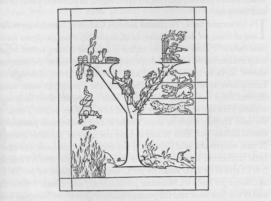
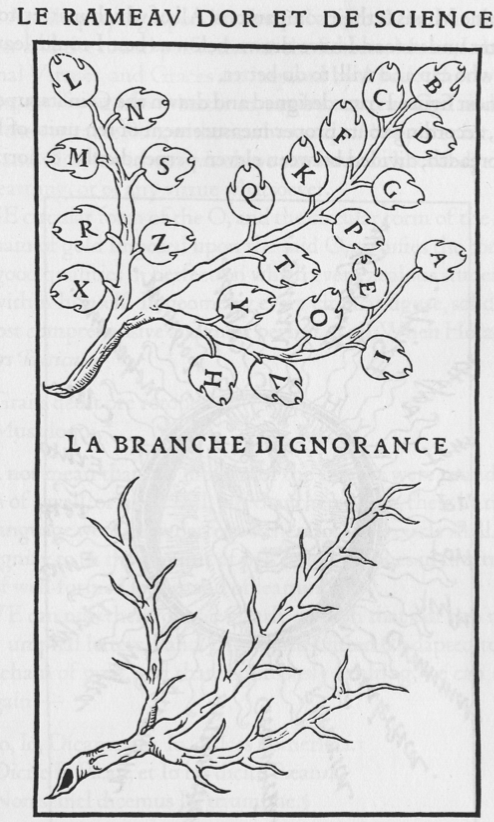
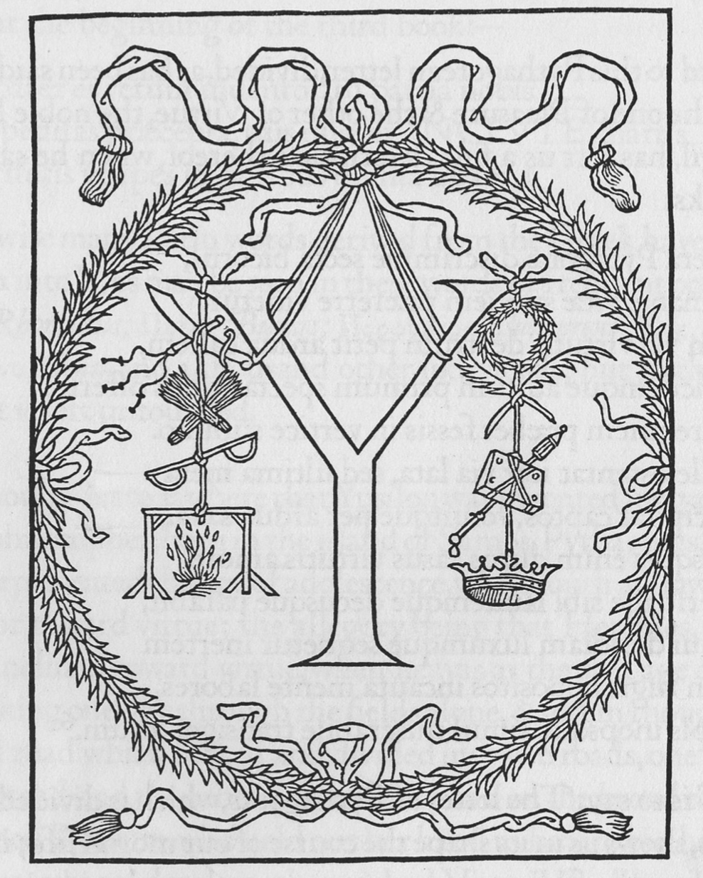
Geofroy Tory was one in a series of scholars, architects and artists, who, in the late fifteenth and early sixteenth centuries, invented the capital letter as we know it today. The serif capital letter was based on Roman inscriptions from the first century AD, which Renaissance antiquarians believed to be aesthetically superior to the scripts they were using at the time, a combination of medieval blackletter and a curving script from the ninth century called the Carolingian. But, as we can already see from Tory’s bizarre conception of the letter Y, the Renaissance reconstruction of this antique form was no straightforward imitation. By the time the form had solidified in the 1520s, calligraphy, architecture, literary criticism, biblical exegesis, mnemonic aids, Platonic philosophy, and Pythagorean number symbolism all played an essential role in its birth.
Many Renaissance scholars were tight-lipped about the sources of their thoughts, preferring to preserve the aura of mystery and awe surrounding the antique. But Tory, a Frenchman outside of the direct academic circles of Italy, in his enthusiasm to explain the perfection of these letters, reveals much about the thoughts behind the construction. And while what historian Stanley Morison called Tory’s “cabalistic abracadabra” may have quickly faded to obscurity, Tory’s work lives on through his student, Claude Garamond, whose typefaces are built into and used by every computer manufactured on the planet.
Published in Printing History, January 2008.